Monday, 24 March 2014

Homage Evaluation


Evaluation

When it comes to printing I made some aesthetic decisions to reflect the technical decisions of each photographer, mainly this came down to paper choice:

Gursky- Gloss 
I decided to choose gloss to get the crisp, polished look that Gurksy achieves with his medium format camera, also gloss paper brings out the vibrancy of the colour nicely, showcasing them at their optimum.

Rodchenko- Satin
I went for a satin paper with my homage to Rodchenko because it enabled me to have a slight shine that would suit the aesthetic however there was a bit more texture there, I thought that this would pick up the edges of each block shape well.

Strand- Textured
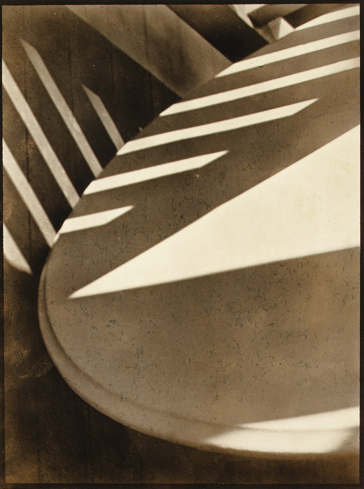
I chose a very textured paper to compliment the textured aesthetic of Strand's image, also I thought that it referenced the idea of repeated pattern.

Moriyama- Matt
I chose matt paper to directly contrast Moriyama's image with it's high shine and high contrast look, I liked the effect that matt paper had upon the grey tones within the image also it kept the muted tones flat and low contrast which was my aim for this homage.


Sizing 

Gursky- I decided to reference the huge scale of the Rhine II as the theme of vastness was crucial to this piece, therefore I printed my homage in A3.

Strand- With this image through research I discovered that the size of it was very small, being only contact sheet size, therefore I referenced this with a near A5 sized print.

Tuesday, 18 March 2014

Daido Moriyama - Tights


Daido Moriyama
Tights

Part of the collection: "Tights and lips" 
Chosen image the one below the one above can't be removed for some reason:


Visual Language: Tights, Constrast, Black and white tonal values, grain, proportion, shot close to the subject, line, shape, pattern, bold, 3-D, power.

Themes: Intimacy, Objectification, Urban life, Abstraction, Intrusive? 

Technical Aspects: Silver gelatin print 34.3 x 41.7cm, Sharp focus, Chiaroscuro Lighting


  • The Guardian, 


"The calves press against the geometrical surface almost to the point of bursting, but the tension is balanced, making the legs very powerful" 

One day I was drinking coffee with my girlfriend when I caught a glimpse of her legs, which happened to be in stockings with fishnet tights over the top. I immediately started taking photographs.


This picture was taken in 1986, and what you see is what you get. The shoot was quite natural: I asked my girlfriend to make an occasional pose, but didn't particularly direct her. I tend not to have feelings or thoughts while I work: I am completely immersed in the visual world of the subject.


Moriyama is known for his raw, gritty gaze, his portrayal of Japan’s dark underbelly in the post-war era. His early career coincided with the cultural changes in that country as it struggled come to terms with the devastation caused by the atomic bombings of Hiroshima and Nagasaki and the resulting surrender of Japan ending the pacific war in 1945. Moriyama devoured and regurgitated what he saw, and it is therefore interesting but unsurprising that his work can feel predatory. 

The Tights with their stark, abstracted lines stand apart from his grainy, chiaroscuro street photography. Yet the sentiment behind the pictures is the same: a desire to observe and preserve the everyday details that are so often overlooked. He sees things the everyday in a very specific way. 

"Being a photographer is a constant battle with countless fragments; the camera allows me to get closer to a subject and capture its detail. The world appears very erotic in my eyes. Tights are only one example".  
http://uk.phaidon.com/agenda/photography/articles/2012/october/04/daido-moriyamas-best-shot/

With many of the Tights pictures it is not immediately clear what you are actually observing and I feel like it is this detail that draws the viewer in, they become intrigued by what is presented to them.


Chiaroscuro Lighting

Chiaroscuro in art is the use of strong contrasts between light and dark, usually bold contrasts affecting a whole composition. Chiaroscuro also is a technical term used by artists for using contrasts of light to achieve a sense of volume in modelling three-dimensional objects, such as the human body. I thought that it was interesting that Moriyama's lighting techniques as photographer that explores the very modern and urban can be likened to historic fine art works.

http://www.vocabulary.com/dictionary/chiaroscuro 


                                                                                                                                                           Another work by Moriyama: Stray dog, Misawa, 1971

We can see that contrast, grain and shadow are signatures in all of his work. Also, the idea of discomfort is prolific throughout the tights image and this one. 

From Nowness- Diado Moriyama: The Mighty Power 

Websites used: http://www.anothermag.com/current/view/2171/Daido_Moriyama_Tights_and_Lips 


My Hommage 


Mainly I drew inspiration from the Visual Language within the image, however I decided to see if I could achieve a very different tone to my image by changing a few of the visual and technical details. Really I wanted experiment with the altering of visual aesthetic,seeing if it were possible to remove the eroticism and intimacy that Moriyama's work is known for but still clearly pay homage to parts of his image. I wanted to channel his theme of abstraction in regards to elements such as close crop, unusual viewpoint affecting proportions and the idea of repeated pattern. I too used Black and white, however I went for rather more muted tones and did not make my image too heavy on the contrast as I felt that this would introduce some eroticism which remember I wanted to dispel from this homage completely. Following that line of thought I also chose to include normal black stockings rather than fishnet tights, again to further abstract the subject matter. 

I also made sure that I referenced the posing of the leg in some way, in my own image I included a leg creasing as I felt that this was a key element compositionally within Moriyama's Tight series. I also noticed that it acts as the identifier in Moriyama's image, so I thought that it could fill the same role in my own image. 

Technically I decided to use a shallow depth of field, mainly to create a sense of abstraction, but also through blurring to reference the intrusive nature of Moriyama's work. 


Paul Strand- Abstraction

Paul Strand- Abstraction, Twin Lakes, Connecticut, 1916

Part of the Collection (American, 1890–1976)


Visual Language: Sepia, shape, shadow and light, diagonal composition, pattern, unconventional angle/viewpoint, image is split into sections of busyness, 

Themes: Abstraction, Forms, Cubism, modernism

Technical Aspects: Silver–platinum print; 32.8 x 24.4 cm, soft focusing, British Ensign Reflex camera producing 3-1/4 x 4-1/4" negatives, has been enlarged by projection to make a larger negative for this contact print.


This picture is among the first photographic abstractions to be made intentionally. When Alfred Stieglitz published a variant of it in Camera Work, he praised Strand's results as "the direct expression of today." Porch shadows and tipped-over tables are not specifically modern, but Strand's picture of them is, for it does not depend upon recognizable imagery for its effect, but rather on the precise relations of forms within the frame. 

Strand made several radical choices in this work: he abandoned the traditional, upright perspective of the photograph; caused the table to appear tipped, as if to suspend its utilitarian function and deployed shadows to create powerful compositional diagonals.  

Strand seemed to be heavily influenced by the cubist movement, experimenting with greater abstraction in his compositions, gradually abandoning a recognizable picture plane and comprehensible subject matter. 

Cubism
The cubist movement strived for abstraction through fragmentation, multiple points of view, and a reduction of people and objects to basic geometry—a photographic form. The act of taking a small part of a scene and abstracting it from everything else is a method I used in my own homage. The Cubist painters reject the inherited concept that art should copy nature, or that they should adopt the traditional techniques of perspective, modeling, and foreshortening. 


Paul Strand and Charles Sheeler created this short silent film that presents a day in the life of lower Manhattan. The sequences display the artists approach to photography and their photographic response to life, featuring extreme camera angles and unusual viewpoints to capture New York's dynamic qualities- aspects of his work that I referenced in my own homage. 

My Homage

Primarily I paid homage to strand's image in terms of visual language, namely the emphasis upon a similar diagonal composition, use of pattern, and even referenced some of the sepia tonal values. I also felt it important to reference the use of light and shadow, which is a key componant of Strand's image, however I use the light differently, casting some parts of the slanting lines into shadow with the use of harsh lighting rather than letting the shadows govern the shot, the highlights are doing so.

I was also referencing a theme of Strand's which was Cubism, I was able to take a very small part of a scene and abstract it from everything else. By composing what is really only the joining of ceiling and wall and drawing the eye to the shapes that make up an everyday scene it strongly references that key influence of Strand's. 

Also in terms of viewpoint, I decided to shoot this image at rather an odd angle to reference the way in which Strand liked to compose his shots. 

He said of photography   "…the camera machine cannot evade the objects which are in front of it. No more can the photographer. He can choose these objects, arrange and exclude, before exposure, but not afterwards". 
After realizing the extent to which Strand is aware of what lies within those framing boarders, I took that away and paid homage to the clearly constructed lines flawlessly placed upon each plane, typical of his work. 

I also referenced the theme of abstraction rather overtly as well as the visual concept of texture, the speckles upon the stone table is mirrored in the textured walls and ceilings of my own image. 


Monday, 17 March 2014

Rodchenko- Gears


A.Rodchenko- Gears 

1929

Gears for AMO
automobile.

Visual Language: close crop, light and shadow, repeated shape, pattern, mirroring, multiple, mass, lack of colour, viewpoint, landscape 
Themes: Repetition, 'the object', constructivism 
Technical Aspects: gelatine-silver print 28.8cm x 23cm 

Research

I decided to explore Rodchenko's theories about art and photography and the reasoning behind his works.


This video talks about the driving forces behind Rodchenko's chosen aesthetic, he is concerned with perspective, form and graphic line and shape- all aspects that I wanted to subtly mirror in my homage. 


Constructivism

Rodchenko was one of the founders of the constructionist movement, Its origins lay in the Russian Revolution of 1917, a time that prompted cultural experimentation following the abolishment of media censorship. A new way of viewing photographic practice with a modernization of ideas was initiated following the belief that photography should move beyond reproduction of reality and instead create something completely new. 
Constructivist art is unlike any other artistic movement, known for standalone pieces in which themes such as minimalism, geometric shapes, graphic lines and architectural influences were explored. New media was used frequently within much constructivist work which helped to produce a style of art that was not fussy but simply arranged. The Constructivist theory of ‘ostranenie’ or the act of ‘making strange’ allowed complete abstraction, objective forms carrying universal meaning were tools used by the movement as there was a desire for meaning and message to translate across multiple countries and contrasting languages.    

The Constructivists compared the artist to an engineer, arranging materials scientifically and objectively, and producing art works as rationally as any other manufactured object. 

Rodchenko's photography was socially engaged, formally innovative, and opposed to a painterly aesthetic. Concerned with the need for analytical-documentary photo series, he often shot his subjects from odd angles—usually high above or down below—to shock the viewer and to postpone recognition. 

He wrote: "One has to take several different shots of a subject, from different points of view and in different situations, as if one examined it in the round rather than looked through the same key-hole again and again."

I was influenced by the constructivist movement in terms of the idea of pursuing odd angles, the idea of 'seeking the ambiguous' as well as pursuing the delayed recognition of the viewer when they look at my image. 

I also looked at the following websites: 

- http://www.bbc.co.uk/photography/genius/gallery/rodchenko.shtml   

http://aleksandrodchenko.wordpress.com/


My Homage

I plan on taking aspects of both the visual Language of this image as well as the overall theme of constructivism into my own homage. 

His images eliminated unnecessary detail, emphasized dynamic diagonal composition, and were concerned with the placement and movement of objects in space. These are the elements I wish to pay homage to in my own image. The landscape format as well as the idea of repetition and mass are also mirrored in my response. 


However the overall tonal values are completely opposite, rodchencko's has a great deal of black with a high amount of contrast whilst I have chosen to wash out my image, include a lot of white and show up the highlights. This has been done to reference the idea of a change in time and attitudes. Rodchenko's was done in 1929 during a time of media control, whereas this image was taken in 2014 in a time of freedom where artistic boundaries and creative responses are motivated by different reasoning. Also, the Idea of modernity is shown, Rodchenko was reliant upon film mediums however I have chosen to shoot in digital raw files to reflect this change in time and advancement in technology. 


Sunday, 9 March 2014

Gursky- The Rhine II

  Gursky - The Rhine II   1999


Visual Language: Water-Air-Earth, colour used to break up image, texture, sharp focus, nature, planes, form, Horizon, muted colour, Platonic, Scale
Themes: The idea of Man-made landscape in that it feature nature but in a constructed way, Line and Shape, Aesthetically driven,  'The Contemporary', Abstraction
Technical Aspects: Medium format, Gursky produced a very large chromogenic colour print of the photograph, mounted it onto acrylic glass, and then placed it in a frame. The image itself measures 190 cm × 360 cm, while the frame measures 81 by 151 inches (210 cm × 380 cm).

    Research

Extraneous details such as dog-walkers and a factory building were removed by the artist via digital editing. Justifying this manipulation of the image, Gursky said "Paradoxically, this view of the Rhine cannot be obtained in situ, a fictitious construction was required to provide an accurate image of a modern river."

Annelie Lütgens, ‘Shrines and Ornaments: A Look into the Display Cabinet’, Andreas Gursky: Fotografien 1994-1998

His aim in using digital technology is not to create fictions but rather to heighten the image of something that exists in the world. He has described the genesis of this work, saying, ‘there is a particular place with a view over the Rhine which has somehow always fascinated me, but it didn’t suffice for a picture as it basically constituted only part of a picture. I carried this idea for a picture around with me for a year and a half and thought about whether I ought perhaps to change my viewpoint ... In the end I decided to digitalise the pictures and leave out the elements that bothered me.

http://www.tate.org.uk/art/artworks/gursky-the-rhine-ii-p78372/text-summary


Here is a video that shows the place where this image was shot,  it documents the manipulation of the image and Gursky's creative aesthetic choices that involve the construction of landscape for aesthetic reasons. 


My Homage 

I decided to take mainly the visual language and reference them quite overtly, I liked aesthetic of this image, the idea of ratio planes, positioning and sharp focus. The overall image is very polished, rather detached and abstracted which were also aspects I voiced with my homage.
Also the idea theme of construction, although this image is a landscape shot, Gurksy has ignored the typical 'rules' when shooting a landscape scene objectifying nature out of a desire to create. He has also manipulated the natural world further, playing upon the idea of man-made and natural, constructing nature by removing aspects digitally that are not visually pleasing. 


So visually I took the polished, abstract aesthetic, the idea of stark emptiness. Like Gursky's image the idea of planes of colour and texture however I chose to address the concept of construction through very literally- architecture. As the Rhine II was taken 15 years ago, it pre-dates this recently constructed, very modern building so to reflect that in the medium I chose, I decided to shoot in digital raw files to reflect this fresher take on Gursky's landscape.